
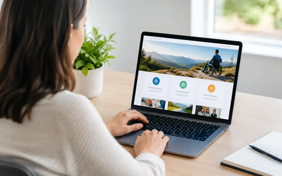
A prospect lands on your website, cannot read the text, cannot use the navigation with a keyboard, or cannot submit your contact form. That is not a minor design flaw. It is a lost lead. This guide to website accessibility explains how businesses can remove digital barriers while building a stronger, more search-friendly website that converts more visitors.
Accessibility is often treated as a compliance task added at the end of a redesign. That approach costs more, creates rework, and leaves valuable traffic on the table. Build accessibility into your website strategy from the start, and it becomes a competitive advantage: clearer content, easier navigation, broader reach, and fewer points of friction between a visitor and your business.
Why Website Accessibility Is a Growth Issue
Website accessibility means designing and developing a site that people with disabilities can use effectively. This includes visitors who are blind or have low vision, are deaf or hard of hearing, have limited mobility, experience cognitive differences, or rely on assistive technology such as screen readers, voice controls, and keyboard navigation.
For business owners, the commercial case is straightforward. If a potential customer cannot understand your services, compare options, call your office, request an estimate, or complete a purchase, your marketing investment is working against you. Paid clicks become wasted spend. Organic visitors leave. Strong service offerings lose to competitors with a more usable website.
Accessibility also overlaps with the website fundamentals that support better SEO and conversion performance. Logical headings help screen-reader users understand a page, and they help search engines interpret its structure. Descriptive image text provides context for users who cannot see an image, while reinforcing relevance where the image genuinely supports the content. Fast, readable, mobile-friendly pages give more people a usable experience.
That does not mean accessibility is just an SEO tactic. It is a customer experience standard. The ranking, traffic, and conversion benefits are the result of serving people better.
A Practical Guide to Website Accessibility
The most effective accessibility work starts with your highest-value pages. For a local service business, that usually means the home page, core service pages, location pages, contact page, booking flow, quote forms, and checkout process. Do not let a polished blog archive distract from a broken lead form.
Start with structure, not surface-level fixes
Every page needs a clear hierarchy. Use one primary page heading, then organize the rest of the page with headings that follow a logical order. Do not choose heading tags because they look bigger or smaller. Styling can change appearance. Headings communicate meaning.
This matters when someone uses a screen reader to scan your page by headings. A page that jumps from a main heading to several unrelated subheadings, or uses bold text instead of proper headings, forces that visitor to work harder just to find basic information.
Keep navigation predictable as well. Your main menu, phone number, service links, and contact actions should appear consistently where users expect them. If a visitor has to relearn the page layout every time they move through your site, you introduce friction that hurts both trust and conversion rates.
Make keyboard use non-negotiable
Many visitors do not use a mouse. They may navigate with a keyboard, switch device, voice control, or another assistive tool. Test your site by pressing the Tab key from the top of the page. You should be able to reach every interactive element, including menus, buttons, form fields, pop-ups, and links.
The selected item also needs a visible focus indicator. If users cannot see where they are on the page, they cannot reliably take the next step. Removing focus outlines for aesthetic reasons is a common mistake with a real business cost.
Watch for keyboard traps. These occur when users can enter a pop-up, dropdown, calendar, or embedded tool but cannot exit it using the keyboard. A flashy booking widget is not an upgrade if it blocks prospects from booking.
Build forms that help people finish
Forms are where accessibility problems become missed revenue. Every form field needs a visible label that explains what information is required. Placeholder text inside a field is not a substitute, because it can disappear when a user starts typing and may not be communicated clearly by assistive technology.
Instructions should be specific. Instead of saying “Enter a valid phone number,” explain the accepted format if one is required. If the form returns an error, identify the field with the issue and explain how to correct it in plain language. Avoid vague messages such as “Invalid entry.”
Ask only for information your team will use. Longer forms usually create lower completion rates for everyone, and they can be especially difficult for people using assistive tools. For a basic consultation request, a name, contact method, service need, and short message may be enough to begin the conversation.
Use color and contrast with purpose
Low-contrast text can make a premium-looking site nearly impossible to read in bright light, on a low-quality monitor, or for visitors with low vision. Your body copy, buttons, navigation elements, form states, and text placed over images all need adequate contrast.
Color should never be the only way you communicate meaning. If a form field has an error, do not rely only on a red outline. Add clear text and, where useful, an icon or other visual cue. The same rule applies to charts, service comparison tables, availability calendars, and promotional graphics.
Brand consistency still matters. You do not need to abandon your color palette. You may need to adjust shades, use darker text, add a solid background behind copy, or reserve certain brand colors for decorative use rather than small text.
Treat images, video, and documents as content
Images need alternative text when they convey useful information. Good alt text describes the purpose of the image in context, not every visual detail. A photo beside a roofing service page might be described as “Technician inspecting damaged asphalt shingles” if that detail helps the visitor understand the service.
Decorative images should be ignored by assistive technology rather than assigned filler descriptions such as “blue background” or “image 1.” This is one area where judgment matters. The goal is useful context, not a script that reads every pixel on the page.
Videos should include accurate captions. If the video communicates essential visual information that is not spoken, provide an audio description or equivalent written content. Downloadable PDFs deserve the same attention. An inaccessible pricing sheet, application, brochure, or intake document can become a barrier after a visitor has already decided to engage.
Common Accessibility Shortcuts That Backfire
The biggest mistake is assuming an automated scan makes a website accessible. Automated tools are valuable for spotting issues such as missing form labels, empty links, or contrast failures. They cannot reliably judge whether your content makes sense, whether a menu is understandable, or whether a form workflow is frustrating.
Another shortcut is installing an overlay that claims to fix accessibility instantly. These tools may offer useful adjustments for some users, but they do not repair flawed source code, unclear content, inaccessible third-party forms, or a confusing navigation structure. Relying on an overlay instead of fixing the site can create a false sense of security.
Do not wait for a redesign, either. Some improvements can happen immediately: update page headings, improve button labels, add descriptive alt text, correct contrast issues, and simplify forms. Other work, such as rebuilding a custom menu or replacing an inaccessible appointment platform, may require development time. Prioritize based on lead impact and user risk.
Put Accessibility Into Your Ongoing Website Process
Accessibility is not a one-time project because websites change. New landing pages, seasonal promotions, software updates, plugin changes, videos, PDFs, and third-party tools can introduce new barriers.
Build a review step into your publishing process. Before a page goes live, check its headings, link language, image text, keyboard behavior, contrast, form labels, and mobile usability. For larger websites, schedule recurring technical reviews and test the paths that matter most to your sales process.
Your team also needs clear standards. A marketing coordinator publishing a new service page should know that “Click here” is weak link text, a sales manager uploading a PDF should know it must be readable, and a developer adding a pop-up should test whether it works without a mouse. Accessibility performs best when it is part of how the business operates, not a problem handed to one department.
A high-performing website gives more people a clear path to act. That means fewer abandoned forms, stronger customer trust, and a digital presence that does not give competitors an easy opening. Make accessibility part of your growth engine, then keep improving it as your business scales.